Examples of CD Covers
Wretch 32 - Black and White

The cover has a side shoot of the artist looking at the ground. The image is desaturated and the contrast of the image is high causing the image to be defined greatly in certain areas. The title black and white speaks for the whole cover but it is also because of this that the cover is quite dull and boring. To be able to design around a cover like this would result in the website to look very professional and more like a business website than a CD promotion website. The back of the cover only has the names of the songs without any images relating to the front cover. I like the cover but find that it would be very hard to design around something like this if it was chosen.
Q–Tip - Period

There is a lot of imagery and graphics going on for this album cover making it more of an abstract artwork than an actual CD. I like the ideas that are going on as its one of those things that you can take put on your wall an people will mistake it for a piece of artwork. If using this for a promotional website there is a lot that can be done to express the artwork and illustrations used in the cover however, to me it seems to be missing a key element. In other covers I have looked at there would be one colour or theme going on that I can pin point and take out. This one however has to much going on that I am unable to do that therefore would not even know where to begin when It comes to recreating a site around its graphics. A great visually appealing album cover however to much going on to make any start.
Meek Mill Dream Chasers 2
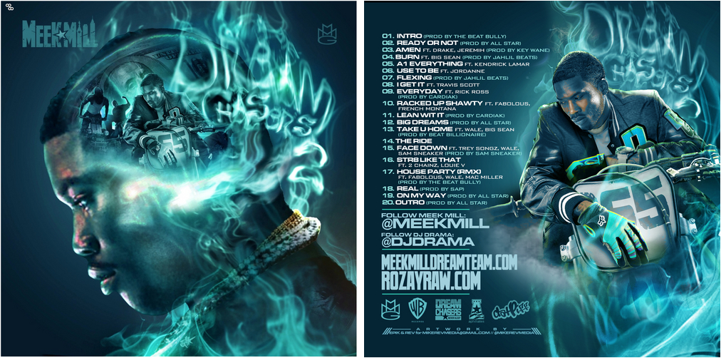
Meek mill has created two CDs that revolve around the theme of his dreams being represented in the smoke coming either out of his mouth (dream chasers 1) or out of his head (dream chasers 2). There are a lot of images that can be seen in the smoke mainly being the things that he desires or strives for e.g. money, women, cars etc. The smoke also turns into the title of the CD cover. I like the colours being used in the cover. Very strong but not to much that its harsh on the eyes. The concept is really interesting as well because it speaks to me about the artist personality wise. This would be a good cover to work around as playing around with the image of the smoke would be quite interesting if pulled off correctly.
